ATV Bili.

A BiliBili client for Apple TV. The playback core — DASH remuxing, danmaku, casting — is yichengchen's open-source project; I forked it and rebuilt the interface. That meant a new design system, a home page of shelves, a collapsing sidebar, a theater-style player, SwiftUI settings, and a fair amount of playback plumbing to make it all feel immediate. This page is about the part a diff can't show: what designing for a TV is actually like.
It's a hobby fork, so there's no store listing. Want it on your own Apple TV? Reach out and I'll send you a TestFlight invite.
The focus engine
On a TV the whole interface is driven from across the room, and the system owns the scroll position. There is one focused view at a time, the Siri Remote moves it in four directions, and the focus engine decides where it lands: on every press, tvOS searches the view hierarchy geometrically and picks the next view itself. Most of the design work on this platform comes down to arranging views so that search does the right thing — and learning the few, badly documented places where you're allowed to overrule it.
My welcome to tvOS came early: the new sidebar rendered fine, focused fine, and did
nothing. Rows lit up, the white pill slid between them, but pressing Select went
nowhere — a bare UIControl never fires
.primaryActionTriggered on tvOS, only UIButton does, and
you find that out at runtime. The fix is four lines. I ended up rediscovering it in
three separate files:
// RailRowButton.swift — why the whole sidebar was dead on arrival.// A bare UIControl does not fire .primaryActionTriggered on tvOS — only// UIButton does. The rail looked alive (rows focused, took the pill),// but Select did nothing.override func pressesEnded(_ presses: Set<UIPress>, with event: UIPressesEvent?) { if presses.contains(where: { $0.type == .select }) { sendActions(for: .primaryActionTriggered) } super.pressesEnded(presses, with: event)}Home screen
The original app is a row of system tabs across the top, each one a flat paginated grid. It works, and it's honest UIKit, but every session starts with a hunt through the tabs. I replaced it with the layout every TV product has converged on: a collapsing icon rail on the left, and a home page of horizontal shelves — 继续观看 (continue watching), 推荐 (recommended), history, watch-later, weekly picks.
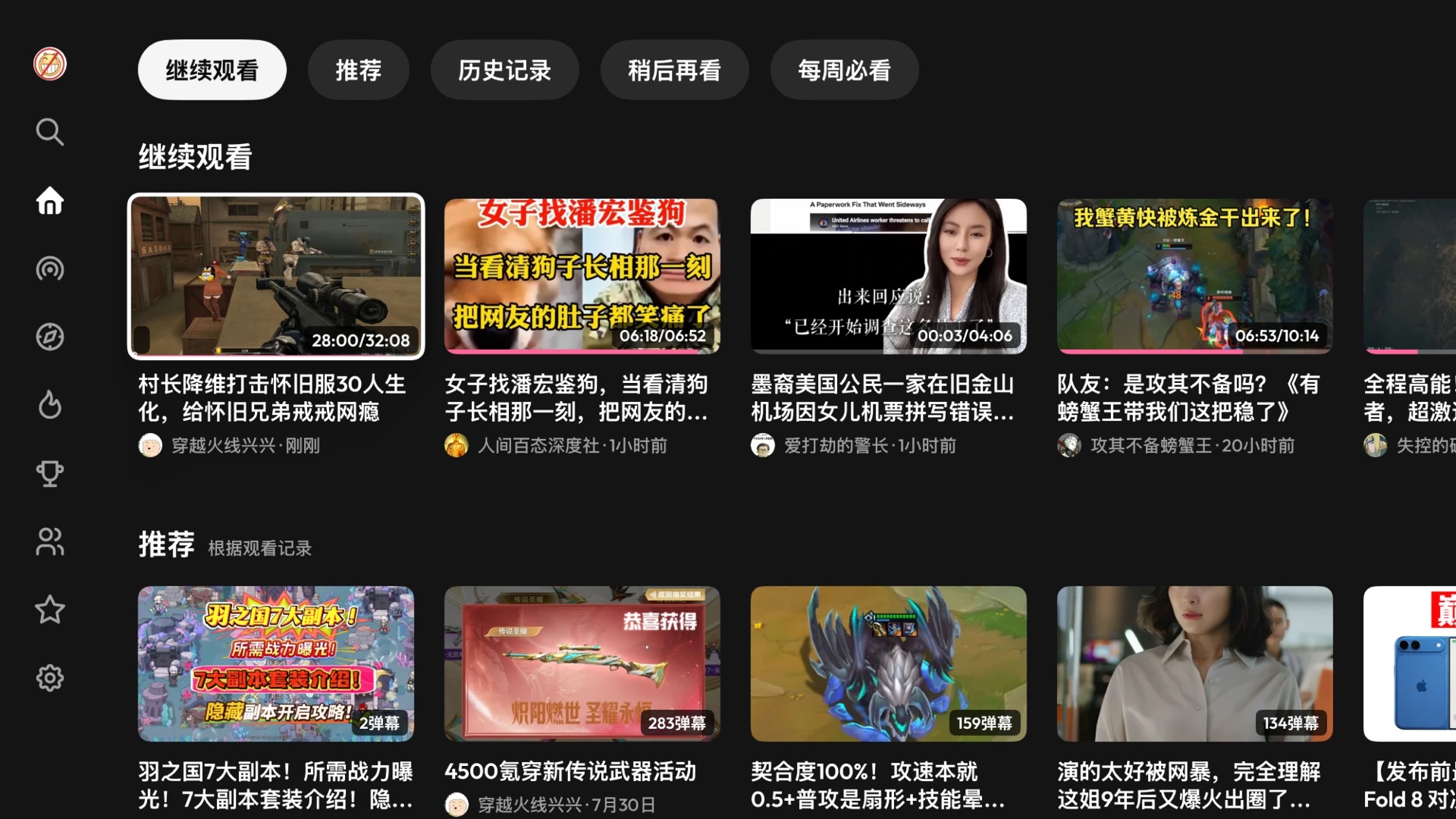
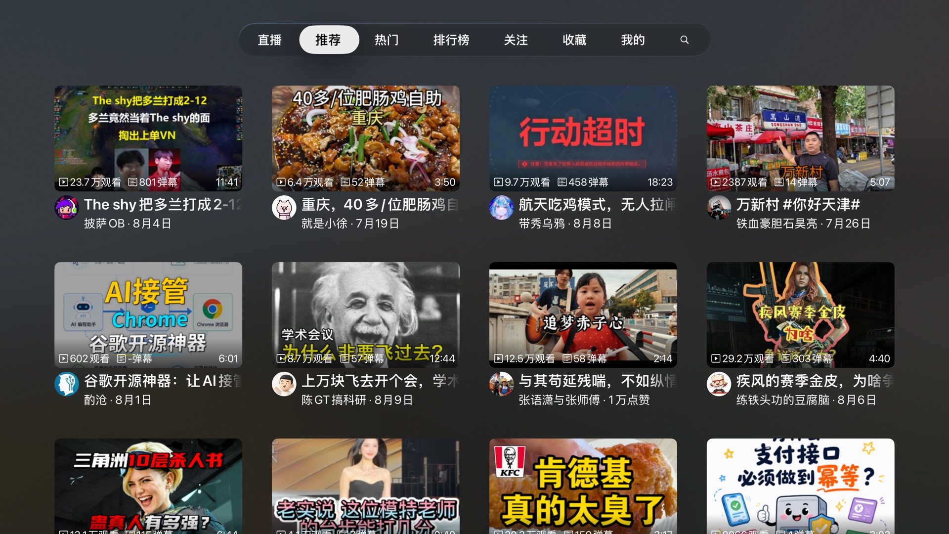
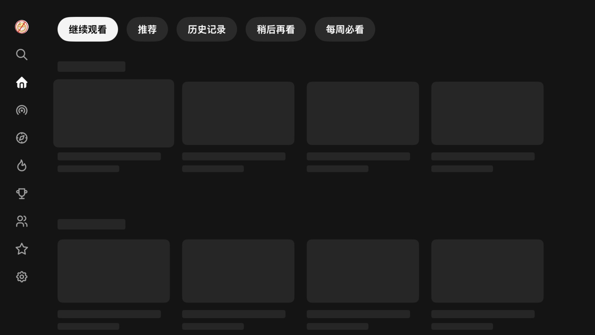
The interesting problems were all focus problems. The chip bar above the shelves works as an index into the page: each chip maps to one shelf and jumps to it, and the bar sits outside the scroll view so it's still there to come back to. The five shelves load concurrently, and ideally whichever arrived first would appear first — but inserting a collection view section above the one the user is focused on shoves the whole page down under them. So arrivals commit in declared order, as far as the leading contiguous run reaches:
// HomeViewController.swift, compressed. Five shelves load concurrently,// but only the leading contiguous run is ever committed: inserting a// section *above* one already on screen shoves the page — and whatever// the focus engine is sitting on — down under the user.await withTaskGroup { group in for (i, shelf) in shelves.enumerated() { group.addTask { (i, try? await shelf.load()) } } for await (i, items) in group { slots[i] = items while let ready = slots[committed] { // commit in declared order only append(section: ready) // below everything on screen committed += 1 } }}Before any of that lands, the page is a skeleton, and the skeleton cards are focusable on purpose. If the placeholders refused focus, first launch would put focus on the rail and leave it there after the content arrived. Because they accept it, and the collection view remembers its last focused index path, focus starts in the content and rides the swap: the card under your thumb turns from grey box into video without moving. The skeleton shows up about 0.8 s after a cold launch (measured below), which gives the ~1.5 s of API round trips somewhere to happen while the page still looks alive.
The rail itself runs on two UIFocusGuides — invisible focusable rectangles
that give the beam search somewhere to land when no real view sits in that direction —
and each guide is enabled in exactly one state. Collapsed, a full-height guide at the
rail's trailing edge catches any leftward move: without it, a card low on a long page
has no row geometrically beside it, and Left goes nowhere. Expanded, the guide moves to
the rail's other edge so Right can reach a content column that has slid out of the way.
The column slides at a fixed width — pinning it to the open rail's edge would
re-solve the compositional layout every frame of the animation, and you can watch the
cards shrink from 384pt to 312pt and back while it happens. Sliding a rendered column
is free.
The theater player
In the original flow, pressing a card opens a detail screen — title, stats, a play button, related videos — and pressing play opens the player on top of that. On a couch it feels like an interstitial: you already chose the video one screen ago, and now you're asked to confirm it. Upstream seems to have felt the same, because its direct-play setting keeps presenting that screen invisibly, as a data source behind a black curtain — so every request it makes still sits between your press and the first frame.

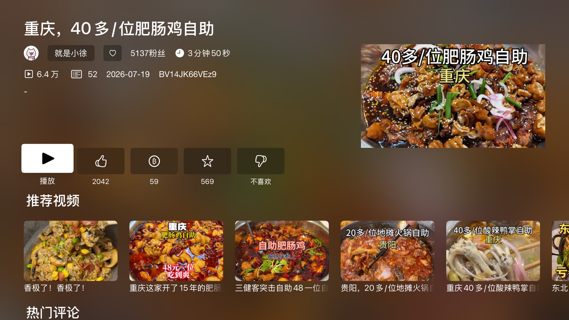
I deleted that screen. A press now presents the theater — the container that owns the player — immediately, with nothing but the video's id in hand. The play-URL request runs during the presentation animation, and the info, comments and related panes stream in behind the picture, so startup work that used to be serial now overlaps motion the user was going to watch anyway. The container can also dock: the playing video shrinks into the top-left corner while a pane opens beside it. The docked rect is the full-bleed rect at one uniform scale (1126÷633 is still 16:9), so the picture never letterboxes or distorts on the way. The player survives the transition intact — the theater only animates the frame of the view the player already lives in, and the AVPlayer, its item and every plugin ride along untouched.
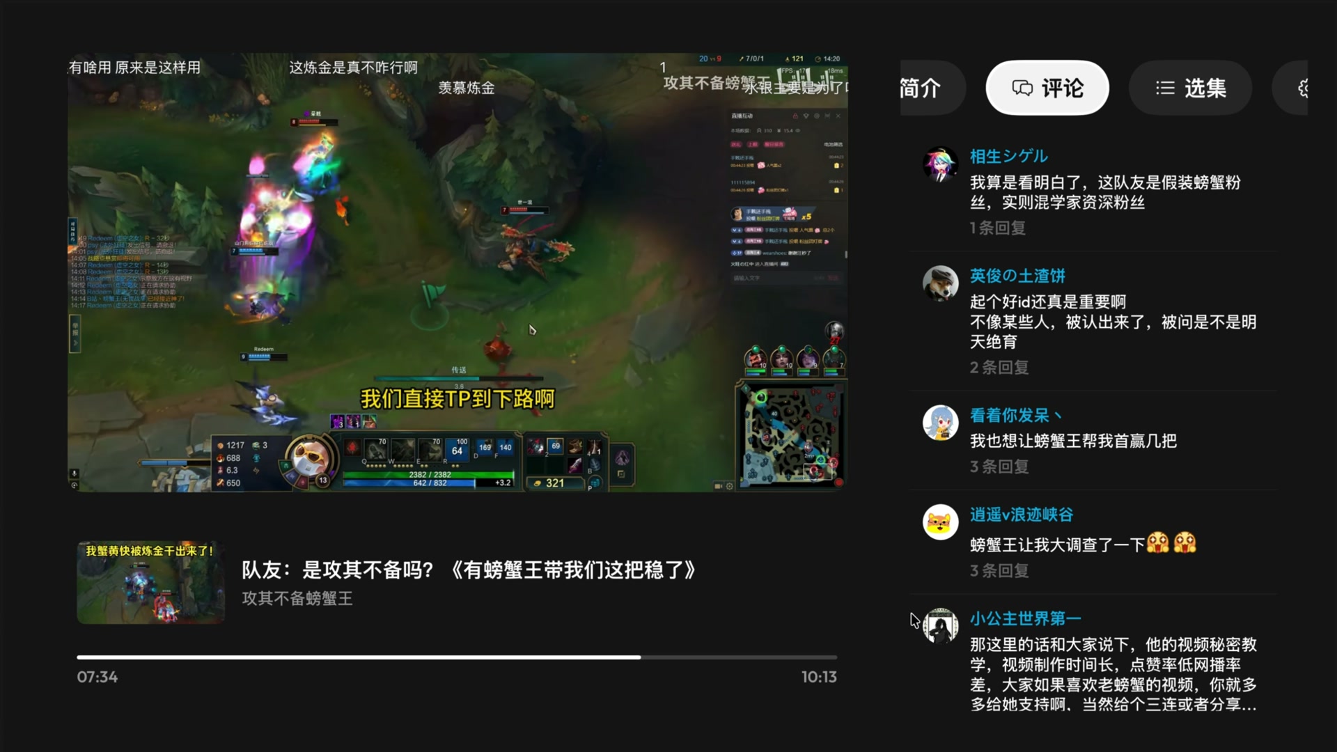
The theater has a price: it turns AVKit's chrome off —
showsPlaybackControls = false — and with it loses everything AVKit gave
for free: the scrubber, play/pause, the buffering spinner, the info panel, and above
all AVKit's handling of the remote. Every input the system player used to arbitrate
now lands in my code, and it turns out the Siri Remote speaks two unrelated languages.
A click of the clickpad ring is a UIPress and walks the responder chain.
A swipe across the surface is an indirect touch and produces no
UIPress at all — so a transport that only listens for presses answers the
click but sleeps through the gesture every other TV player wakes on. The idle theater
arms four swipe recognizers (one per direction; a single masked recognizer drops
off-axis thumb strokes) restricted to allowedTouchTypes = [.indirect],
and disarms them the moment the controls come up — once something on screen is
focusable, those same swipes belong to the focus engine, and a recognizer on an
ancestor would be fighting it.
Even with the controls up, the engine needed overruling in one place. The scrubber wants Left/Right for seeking, but the play button sits directly to its left — and since the focus engine gets first refusal on every directional input, Left moved focus onto the button and the seek never ran. The fix is a veto:
// TheaterFullscreenChrome.swift. The play button sits directly left of// the scrubber, so Left moved focus onto it and the scrubber's seek never// ran; only Right, with nothing beyond it to move to, ever reached it.// Refusing the update hands both directions back to the bar. Vetoed here,// on the chrome — the ancestor is reliably in the chain for every move.override func shouldUpdateFocus(in context: UIFocusUpdateContext) -> Bool { if context.previouslyFocusedItem === scrubber, context.focusHeading.contains(.left) || context.focusHeading.contains(.right) { return false } return super.shouldUpdateFocus(in: context)}
Two more fixes of the same kind, briefly. Menu is handled by a
UITapGestureRecognizer rather than pressesBegan, because a
Menu press made inside the docked panel never reaches the container's press chain — UIKit
dismisses the whole presentation first, which turned "back one level" into "quit
playback". And when the transport wakes, focus is claimed only if the controls are
actually arriving: every button press routes back through the same wake call to
restart the auto-hide timer, and an unconditional focus update threw focus back to the
head of the row on every press — tap ±10s once, and your next Select landed on
play/pause instead.
Modals
Replacing UIAlertController started as a correctness fix and picked up its styling later. If playback fails while the theater is still animating in, the player — a
child controller — tries to present its error alert during its parent's presentation,
and UIKit silently drops it. All the user gets is a black screen; the message and its buttons went down with the alert. In the rework, containers own their alerts, and the alert itself is a
SwiftUI panel presented over everything: MorphingModal, one component for
every confirm, notice and picker in the app.
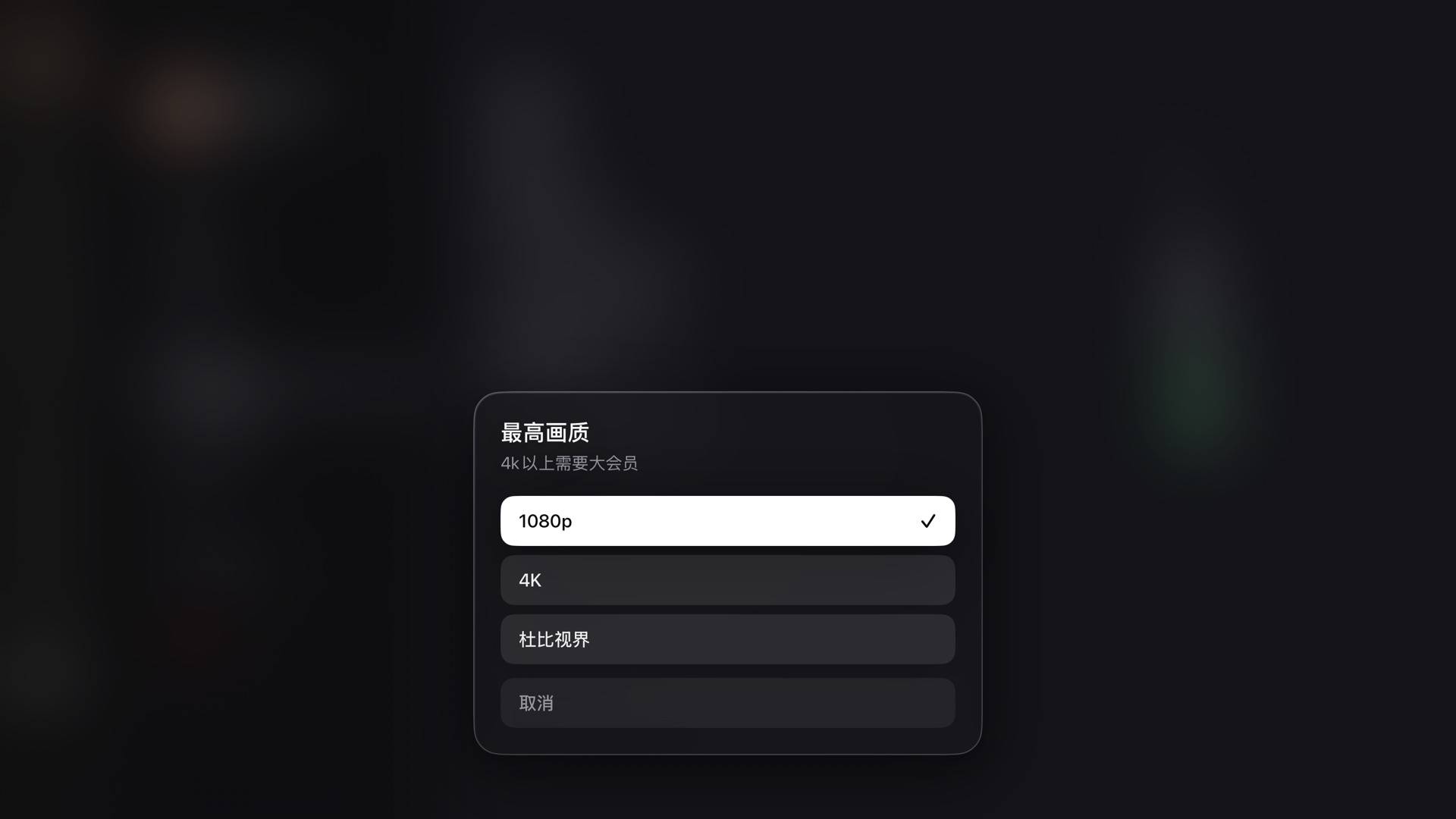
Its motion numbers were ported from a web component, with one correction on the way in: the reference spring (mass 0.5, stiffness 420, damping 40) is overdamped — critical damping at those values is 2√(km) ≈ 29, so 40 puts the ratio at ~1.38, and an overdamped spring spends its last third of travel crawling. On a TV the crawl read as lag, so the panel runs at exactly critical damping (ω₀ = 40 rad/s, settle ≈ 120 ms, no overshoot — a dialog that wobbles on a ten-foot screen reads as cheap). The focus engine, meanwhile, needed three separate concessions, ending in the least dignified code in the repo — which ships anyway, because the alternative is a visible focus jump off the cancel button a frame after every open:
// MorphingModal.swift. The panel enters at opacity 0.01 — not zero,// because a fully transparent view is not focusable, and a panel that// entered from 0 had no rows for the focus engine to choose from during// its first update. Even then `defaultFocus` loses that race often// enough that the panel re-states where focus belongs — five times, each// rung timed to land inside the entrance animation, where a correction// is invisible. The last one is insurance; reaching it means something// is wrong anyway.static let focusClaims: [TimeInterval] = [0, 0.016, 0.04, 0.08, 0.16]private func claimFocus() { for delay in Motion.focusClaims { DispatchQueue.main.asyncAfter(deadline: .now() + delay) { focusTarget = initialFocus // the value the picker opened with } }}Design tokens
Two token systems drive the visuals, and both were measured from something real. The UIKit system (DS.swift) is transcribed from a
reference design and verified at 1920×1080; its colors come in appearance-aware pole
pairs — the focus pill is always the opposite pole of the ground and its ink the
counterpart, which is what lets a glyph invert on focus instead of washing out. The
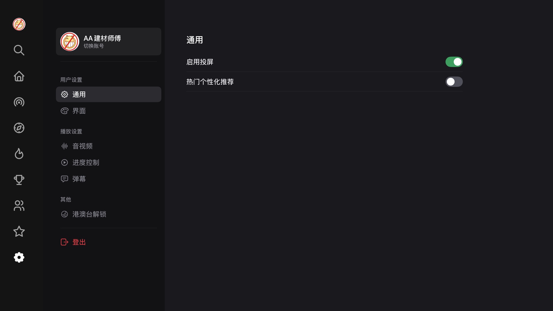
SwiftUI settings screen runs on a second set (Theme.swift): tokens
extracted from Discord's live web client CSS custom properties, kept in web pixels,
then scaled by exactly ×1.5 — at 1080p a point is a pixel, and a 16px
row label doesn't survive ten feet. The result is a settings screen with web-level
information density that still reads from the couch, wearing a focus style of its own in place of the native tvOS lift, halo and scale. Getting rid of those took its own fight: a custom
ButtonStyle to suppress the system treatment, and
.focusSection() on each column, because the raw beam search finds no path
from a low sidebar row to a high pane row.
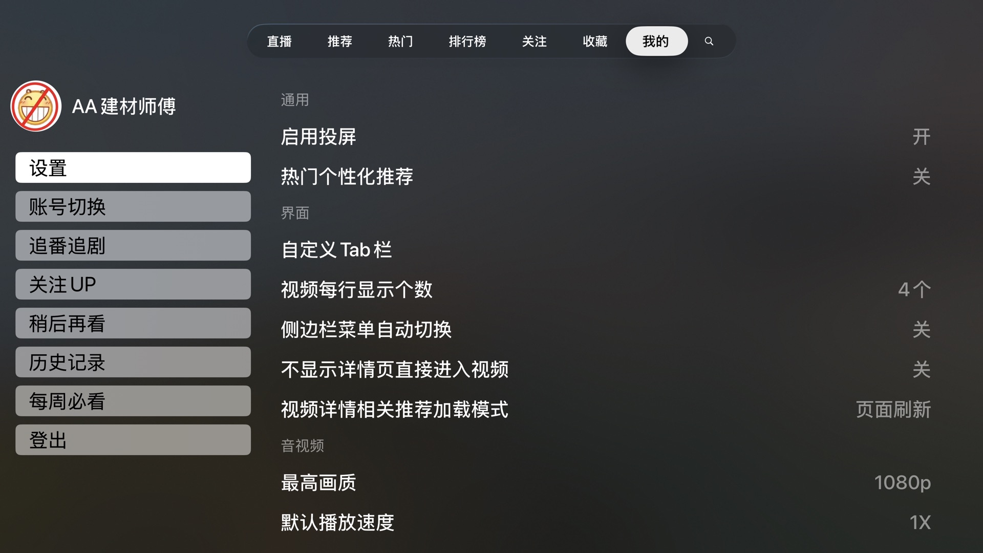
UISwitch does not exist on tvOS, and the upstream convention of 开/关
text made every toggle read like a picker.
The same discipline goes down into details that are easy to shrug off. The two chips on a card — duration bottom-right, stats bottom-left — used to sit at visibly different heights, because one sized itself around an icon and the other got its padding from literal spaces in the string. Now both share one height and one inset, and the corner radius comes off the card's own:
// DS.swift — the chip on the card. An inner corner sitting `inset`// inside an outer corner of `Radius.card` has to be `card - inset` for// the two curves to stay parallel; anything else and the chip reads as a// sticker laid on the card rather than part of it.static let radius: CGFloat = Radius.card - inset // 16 - 8 = 8
The display face is Outfit, a single variable file, which tvOS makes harder than it
should be: the file's default instance is Thin, its named instances carry no
PostScript names, and CoreText substitutes on its own — ask for a family that
doesn't exist and Helvetica comes back with no error. So every weight is dialled on the
raw wght axis and the resolved family name is verified before a font is
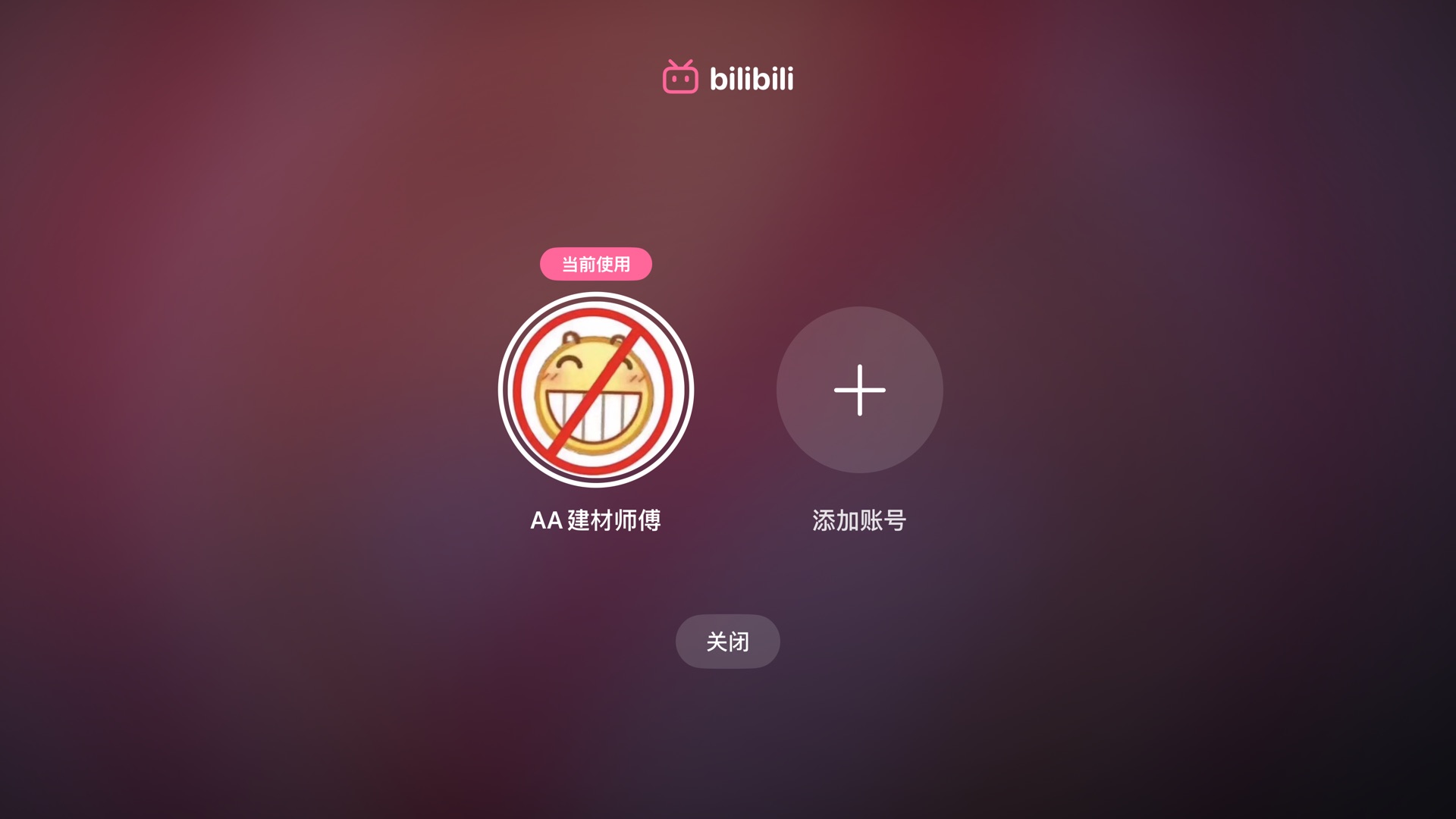
handed out. Even the login QR is a design surface: the module matrix is read back out of
the generated bitmap and redrawn — runs of modules merge into capsules, the finder eyes
become brand-pink squircles, and the error-correction level is lowered from H
to Q on purpose, because fewer, fatter modules are what make the rounding legible at
ten feet. Scanners read luminance alone, so the data stays
near-black.

Startup performance
Upstream attacked startup latency speculatively: pre-build entire players — asset,
resource loader, prefetched segment index — for the videos around your focus, and hope
you press one of them. It worked, but it cost real API calls against rate-limited
endpoints for signed URLs that expire, four live assets in flight at a time, and a
tail of cancellation-race fixes. The rework deletes that pipeline and goes after the
same seconds from three cheaper directions: prefetch only the one id that's idempotent
and free (the video's cid, fetched after a 250 ms dwell on a focused
card); present the theater on the press, so the network overlaps the animation; and
coalesce the duplicate requests one press fans out (the player and the panes both want
the same detail JSON — whoever asks first opens the connection, the other joins it).
The DASH shim earns the rest. tvOS AVPlayer doesn't speak BiliBili's DASH, so the app
synthesizes HLS playlists on the fly (an atv:// resource loader), and two
lines of that playlist are doing perceptual work:
#EXTM3U#EXT-X-START:TIME-OFFSET=214.6,PRECISE=YES#EXT-X-STREAM-INF:AVERAGE-BANDWIDTH=1183000,CODECS="hvc1..."atv://dash/0#EXT-X-STREAM-INF:AVERAGE-BANDWIDTH=2470000,CODECS="avc1..."atv://dash/1
The EXT-X-START tag is the resume position — before it, the player buffered
from 0:00, then seeked, throwing away an entire forward buffer and paying startup twice.
And the first variant listed is the cheapest codec of the top quality tier, because a
cold AVPlayer takes variant #1 before it has any bandwidth history — HEVC first means
the first segment is 30–40% fewer bytes at the same quality. Per-session CDN host
probing (serial, 256KB per candidate, deferred 12 s so it never steals the first
segment's bandwidth) is remembered for ten minutes and keyed on the candidate set,
so the next video on the same CDNs starts on the measured-fastest host for free.
simctl screenshots at
~3–4 fps with monotonic timestamps; the number is the first frame showing each
state, so ±0.3 s. Three interleaved runs each — skeleton 0.80–0.91 s, first
shelf 1.63–1.91 s, settled 2.08–2.59 s; original settles 1.18–1.21 s on
an empty default tab, and its grid lands 2.46–2.56 s after a manual hop
to 推荐 (drawn hatched; the human reaction time between the two isn't counted).
Simulator numbers are good for comparing the two builds; hardware needs its own run.
The chart stops one number short on purpose: press-to-first-frame for playback. Neither branch instruments it, and a screenshot poll can't separate the theater's entrance animation from buffering. The pieces above — the resume hint, the cheap first variant, the remembered host, the overlap with the presentation — each rest on mechanism alone. On a hobby project I'd rather say that plainly than dress a plausible number up as data.
Conclusion
Credit first: the DASH playback core, the danmaku engine, the DLNA casting and the API layer are yichengchen's and its contributors' work. The rework deleted some of upstream's newest UI experiments, but it stands on that foundation and says so. It remains a hobby fork — sideloaded, unaffiliated, and one BiliBili API change away from breaking. There are rough edges I know about: two design systems coexist (the UIKit one is appearance-aware, the web-derived one is dark-only, and they disagree on principle); the like/favorite tints flip optimistically and can lie if the request fails; favourites always land in the default folder because a picker over a playing video wasn't worth it; and the modal restores focus on dismissal by UIKit convention rather than by design. A rework is finished the way a lawn is mowed — it'll need doing again. But the focus engine and I are on speaking terms now, and that was the point.
Source: github.com/AvocadoKing1210/ATV-Bilibili-demo,
branch ui-rework. Built on
yichengchen/ATV-Bilibili-demo
— an unaffiliated, non-commercial demo project; the original's disclaimer applies here in
full. Screens captured 2026-08-13 from the tvOS 26.5 simulator.